
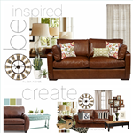
I’ve been putting together some inspiration boards for my living room makeover.

Each house has a voice, hopefully it says a lot about those that live in it.
Here are four of the inspiration boards that I put together for our own family room.
ocean tones
I love the soothing tones of this color palette.
Cool tones can make a room look fresh and clean.

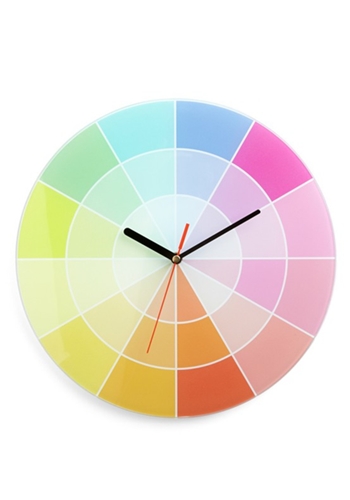
pieces source here
Three more to go!
earth tones
This color palette is a little brighter. The pops of red brings attention to the eye.
These greens have a yellow undertone that make the space warm and cozy,
bringing the outdoors into the indoors.

pieces source here
modern
Here the high contrast between black and white are balanced
by the neutral soft tones of grays and natural elements such as the baskets and plants.
The yellow gives the space a modern flair and a bold pop of color.
It is fun and young.

piece by piece here
neutrals
This is so me!
I love that here is the texture instead of the color what makes this space interesting and warm.
Overlaying patterns and different tones of neutrals can be as striking as bold colors.

piece by piece here
All four have the same sofa since I am not changing mine.
We love our couch and that is a part of the room that will stay for sure.
Keep in mind that the personal touches is what makes a house a home.
These are just combinations of colors and accessories that we like,
hopefully the final project is what we’ll love.
For more tips about understanding and using color,
make sure to check out one of my favorite post.
So… which one is your favorite?
The ocean tones, the earth tones, the modern look, or the neutral tones?
Leave me a comment I would love to hear your opinion!
Don’t forget to come back to link up your projects!
The link party starts at midnight!
Besos
Desirée

I love the neutrals, but I also love the ocean tones. I can’t wait to see this room done as I’m planning to update my living room this year and I always love what you choose.
I love love LOVE the ocean tones board! You inspired me to create a Polyvore set for my living room, using the furniture we already have– and I actually stole some of the props from your board 😉 (Here: http://www.polyvore.com/cgi/set?id=69120019) I’ve been in somewhat of a design stalemate lately, but just this little bit of visualization seems to be clarifying what I really love. 🙂 Thank you!
Ocean Tones hands down!!! Of course, if you know me even a little, you know I am obsessed with teal and it’s like color friends!
I love the Ocean Tones! And I bet it would go beautifully with the rest of your home. I think the lamp from Earth Tones and the baskets from Neutrals would go perfectly with the Ocean Tones, also. 🙂
I responded most strongly to the Earth Tones. But,,, it feels to me that you respond most strongly to the Neutrals. Go with your gut, you need to LOVE the space you live in.
ocean tones….it gives the room more visual interest. The blues are a significant contrast to the heavy furniture and lighten up the room. Makes it feel more playful and friendly. Good luck.
Can we mix two? I love the ocean tones colors, but I would mix in some of the texture cuteness from the neutrals.
I love the neutral! But maybe because it is more my style. The second would be ocean. How did you do this? I would love to try it with my living room! Is that your real sofa? This is so cool!
I love the colors in the first one, but I tend to lean more toward the neutrals. With lots of that green swatch you have mixed in. I love me some green. The boards look great, how fun!
I like both the ocean tones and earth tones. The furniture pieces in the earth tones probably make that my top choice. It is versatile enough so that, if you wanted to change it up in the future, you could still use most of the pieces and just change the accents in the room.