
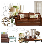
I’ve been putting together some inspiration boards for my living room makeover.

Each house has a voice, hopefully it says a lot about those that live in it.
Here are four of the inspiration boards that I put together for our own family room.
ocean tones
I love the soothing tones of this color palette.
Cool tones can make a room look fresh and clean.

pieces source here
Three more to go!
earth tones
This color palette is a little brighter. The pops of red brings attention to the eye.
These greens have a yellow undertone that make the space warm and cozy,
bringing the outdoors into the indoors.

pieces source here
modern
Here the high contrast between black and white are balanced
by the neutral soft tones of grays and natural elements such as the baskets and plants.
The yellow gives the space a modern flair and a bold pop of color.
It is fun and young.

piece by piece here
neutrals
This is so me!
I love that here is the texture instead of the color what makes this space interesting and warm.
Overlaying patterns and different tones of neutrals can be as striking as bold colors.

piece by piece here
All four have the same sofa since I am not changing mine.
We love our couch and that is a part of the room that will stay for sure.
Keep in mind that the personal touches is what makes a house a home.
These are just combinations of colors and accessories that we like,
hopefully the final project is what we’ll love.
For more tips about understanding and using color,
make sure to check out one of my favorite post.
So… which one is your favorite?
The ocean tones, the earth tones, the modern look, or the neutral tones?
Leave me a comment I would love to hear your opinion!
Don’t forget to come back to link up your projects!
The link party starts at midnight!
Besos
Desirée

I love the neutrals one, but perhaps its because I adore all the pieces. I have lots of neutrals but I have a bit of turq. and yellow too. I love all of them and you will make any one look great. Have fun. xo jen
The Neutrals board is my favorite, I like the modern shape sofa with the farmhouse table, baskets and multiple prints. Sooo fun yet relaxing!
xoxo, Tanya
Great color choices in all of them! The ocean pieces seem to light and airy for the couch. I like the rug in the modern, it’s a good anchor piece, but the yellow and grey just didn’t seem right for your couch. The earth-tones kept a light feeling with the grounded feeling needed for the couch. I like this for an uncluttered look. The neutrals is my fav! The pieces are heavy enough to work with the couch and the larger anchor pieces give it a grounded feel. The other pieces keep it light but still have weight to them. I can see that you used some of the pieces in several picks. You put the very best in the neutrals! Beautiful picks!
where are the curtains from in the ocean tones? the whole look is great!
I like them all but the Neutrals board with all the texture is my favorite for sure!
Your post is so timely. We live in Louisiana and we have had rain for two weeks straight. I have taken down Christmas decorations and everything is so bare and blah. I am craving color. We too have a brown sofa so your mood boards were perfect inspiration for me. I am going in the ocean tone direction for me. For you, either the one with tonal texture or the one with the pop of yellow in it. Whatever one you pick I am sure it will be lovely.
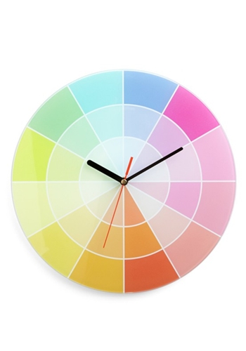
Thanks for sharing this post. I am off to read about the color wheel.
I think all are great but I am definitely in love with the last one. I think it would last longer without the need to redo anything, which is a total selling point in my book. It’s nice, classic, not boring, and family oriented. If it wasn’t that one, I’d go with the first one. The blues look fantastic with the brown couch.
I just love your website. I get up every morning at 5:00 a.m. to get ready for work, and the first thing I do is check your website! I like the earth tone makeover best. The color’s just seem to pop! Keep up the good work and have a great day!!!
The Neutrals board has my vote. I can’t wait to see the finished room!
I like the Modern option. That yellow does wornders among so mucg brown… it’s a home that speaks of happy vibes and relaxing moods. Ocean tones also has hard-to-beat pieces like that precious console.
Looking forward to learn what you chose.
Have Fun!