

One of the questions I get asked often is what color of paint and brand I use.
I normally try my best to add to my tutorials the products I use.
However I thought it would be a good idea to have as a reference in one place some of the paints I use the most.

WHITE
I use white paint a lot.
One of the projects I recently did in white was my kitchen.
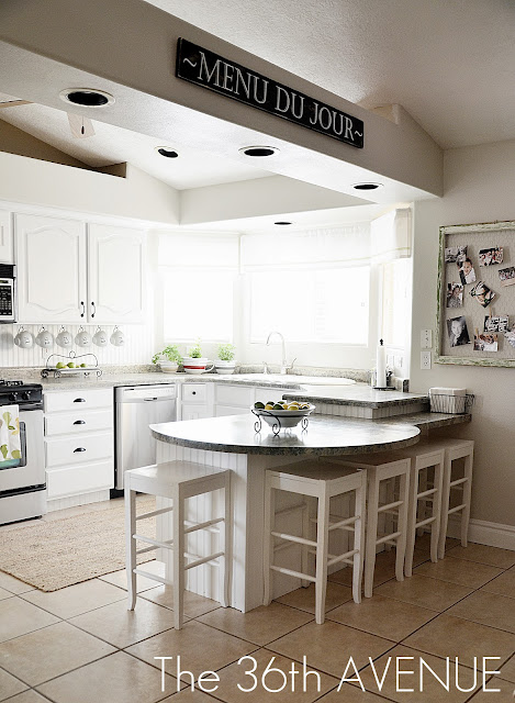
{ Click HERE to see the reveal.}
The color I used was the basic true white from Olympic ONE.

The reason I chose this paint was because it is paint and primer in one.
The white came out true and rich but not ultra white.
This paint provides mildew resistant coating which is perfect for kitchens and bathrooms.
It was easy to apply and easy to cleanup.
So it was perfect for me!
You can find Olympic Paints at Lowes.
Off White or Ivory
I use this color a lot.
It is one of my favorite colors for furniture.
You may remember seeing it on my dining room furniture makeover.

{ Click HERE for the reveal. }
Actually most of the furniture in my front room { coming up next week } was painted with
Cotton Blossom by Dutch Boy Refresh.
I love their Satin finish.
Are you ready?
In my opinion they have the best quality paint out there.

Ivory is a tough color. It is hard to find an antique white or off white that doesn’t have a gray or yellow undertone.
Well… Dutch Boy has it!
Their paint is delicious.
The texture and color is just supreme and the paint does not smell.
It covers a lot of area and I love the paint container.
Did I say LOVE?
Honestly amazing!
{ Click here to find Dutch Boy Paint in your area}
BLUE
Since I am in my dining room let me point out the blue accent color inside of the hutch.

{ Click here for the hutch reveal }
This egg blue is gorgeous and almost a neutral.
It is made by Valspar and the name of the paint is 5002-3A Distant Valley.
Valspar has wonderful colors and they are always keeping up with the new trends.
You can find Valspar Paint at Lowes also.
Another blue that I love by Valspar is the one I used on my Craft Room table and accessories.

{ Click here for my Craft Room tour}
The name of the paint is Sea Air { 5006-9A }.
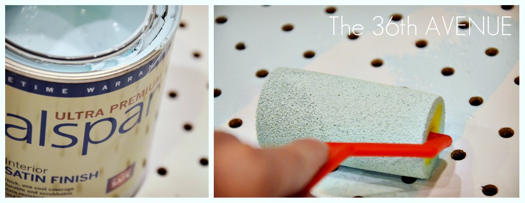
I used this same paint for my Jewelry Peg Board Station.
I am telling you this color is perfection.

{ Check out the Peg Board Tutorial HERE }
My Walls
Now believe it or not the color I get more questions about is the color of my walls.
Before I tell you about it I want to touch on the basics of neutrals.
Lighting will change the look of a neutral completely.
Tans can look pinkish, grays can look purplish.
Not good!
Because they are hard to choose I am sharing with you the three neutrals that I love the most and therefore I use them all over my home.
Tan
Natural Linen by Glidden is the color you see on most of my walls.
It is on my dining room walls, entryway, hallway, kids bathroom and it is the tan I used for the stripes in my nook area.

{ Click HERE for the reveal. }
I love this paint because the undertone is… tan.
No pink, no peach, no yellow… just tan. Yes!
You can purchase it at Home Depot.
Gray
Another neutral is the gray I used for the stripes on my Mud Closet.

{ Click here for the tutorial }
The name of the paint is Quilt { D16-2 } by Olympic ONE.
I love this color so much that I am thinking about using it as part of my Laundry Room Makeover.
It is super clean and pretty.
Again the undertone is gray. Not pink, not purple. Yes!

Grayish Tan
The last neutral I am sharing is the one I used for my kitchen and family room walls.

It is made by Valspar and the name is Woodrow Wilson Putty {6006-1A}
What I love about this color is that it is super light and fresh with a gray or tan undertone depending of the lighting.
We love it!
TIPS
1. In most cases paint will look darker in your home.
2. Before you purchase your paint {specially neutrals} ask what colors are in the formula.
Most tans have red, brown or purple as one of the colors.
My advice is choose neutrals that have brown instead of purple or red.
3. It is worth it to buy a sample color, around $2 if you are not familiar with color undertones.
4. If color works in nature…it will work in your home always.
5. Learn how to use the color wheel. Colors share relationships.
Some of them like each other better than others, some of them are family, neighbors, some of them are warm, cool, some of them complement each other and some of them are better to be left alone.

You can click here to learn more about how the color wheel can work for you.
WOW!
That was a lot in one post.
I am thinking about sharing with you my favorite bright colors… let me know if you would like to learn more about it and I will make a post.
Have a Colorful Happy Monday!
Desirée

Hi there thinking about painting my colonial dining room Woodrow Wilson Putty Valspar 6006 1A (top of Chair rail) and Ivory Brown 6006 1C on bottom. Kitchen is off DR (open concept) and I am thinking about painting kitchen Oatbran 6006 1B Cabinets are white island is black I have refinished wood floors throughout. What do you think? Thanks!
Fabulous post, so much inspiration! I’ve got his linked to my painting post too today, rounding up great DIY painting advice posts like yours!
Thanks Desiree I appreciate all the information about the neutral paint colors too. It was very helpful to me. I am going to paint my galley kitchen (small) it has no natural light. It has oak cabinets and flooring and I have been racking my brains for a nice color to use. I think some of your suggestions in the neutral section might work. Yes please post about your other favorite paint colors. Thanks again for also posting the brand and color they are.
You are welcome! Thank you so much for visiting with us today and taking the time to drop a comment.
Have a wonderful weekend!
Gray paint is really tricky colors, so….I did a lot of research on gray paint and i find this Light French Gray paint and i try it to my room then the result was so nice…have a try of this paint.
Well I’m a neutral color paint gal and sometimes (most times!) I get them wrong. Your tips will come in handy for me.
~Bliss~
thanks Desiree, this is great information, it’s going in my “future reference” file
Thank you for this post!! I always have trouble with colors. I see tan walls at other people’s houses and i love them, but when i have tried it on my walls they always come out purple. Now i know why. I’m so glad you posted the individual colors and brands. I will be trying some of them very soon! I would love to read a post about bright colors too!
What a great, educational post! I’m trying to convince my hubby to paint out family room, nook & kitchen (can’t paint one without the others due to rounded edges) and this post is very helpful.
I’d love to learn about bright colors too if your offer stands!
I just love your blog and I wish some of your talent would rub off on my just by looking at it 😉
Now I’m off to learn about the color wheels as my next project is do something with my little one’s room and pink is her color or choice and I’d like to combine it with something else.
Okay, now I’m a little concerned. I just bought Valspar’s paint called “Foggy Mirror” which is a wonderful gray color, and I’m using it to paint in my bathroom. But, having read that it can look purple-y, I’m afraid to do it! I have lots of wood moldings and wainscotting in the bathroom, and that would totally clash with purple (I barely convinced my boyfriend that gray wouldn’t clash).
Don’t worry about it. Some grays do that specially against white but some other grays don’t. The most important thing is that you love the color. Give it a try!